
You can arrange the cards on your Home dashboard the way you work: hide the ones you don't use, move the ones you check first to the top, and put related cards side by side. The greeting, the Get started checklist and the quick actions stay where they are.
Your arrangement is yours alone. Other people in your account keep their own, and if you work in more than one organisation, each one keeps a separate arrangement. Until you customize, you see the default layout.
Open Customize
On Home, click Customize at the top right. The cards turn into compact placeholders in their current rows, so you can see the whole arrangement at once.
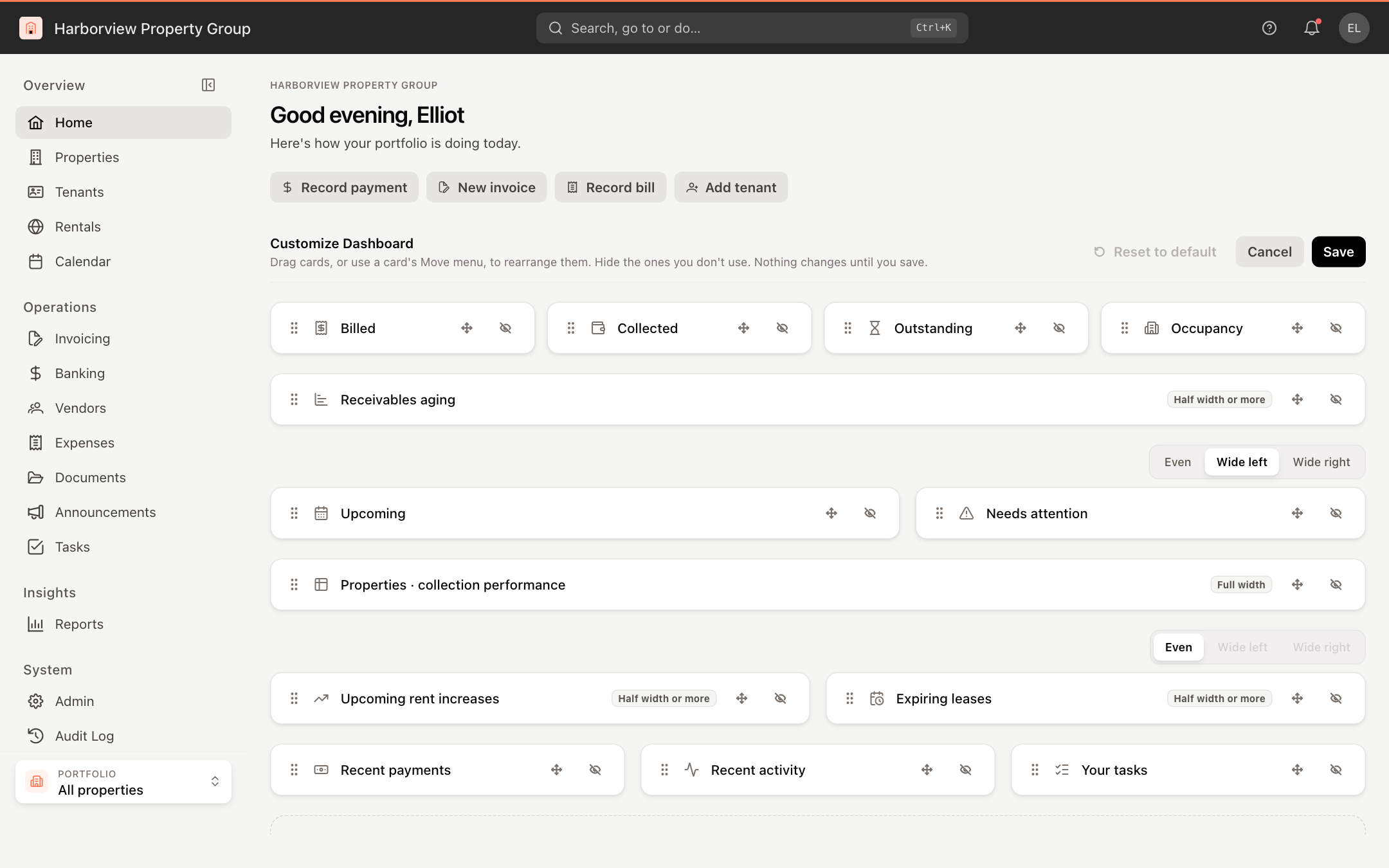
Nothing you change is saved until you click Save. Cancel closes Customize and keeps your dashboard as it was.
Hide and show cards
- To hide a card, click its Hide button (the crossed-out eye). It moves to Hidden Cards below the rows, and the cards left in its row widen to fill the space.
- To bring a card back, click it under Hidden Cards. It returns as a row of its own at the bottom, and you can then move it where you want it.
You can also drag a card onto Hidden Cards to hide it, or drag a hidden card into place.
Move cards by dragging
Drag a card by its handle (the dots on its left). An orange bar shows where it will land:
- Beside another card — the card joins that row.
- In the gap between two rows — the card starts a new row there.
- Elsewhere in its own row — the cards in that row swap places.
If a card can't go somewhere, no bar appears and it stays where it was. See What fits in a row.
Move cards with the Move menu
Each card also has a Move button (the four-way arrow). Use it from the keyboard, or on a touch screen where dragging isn't available.
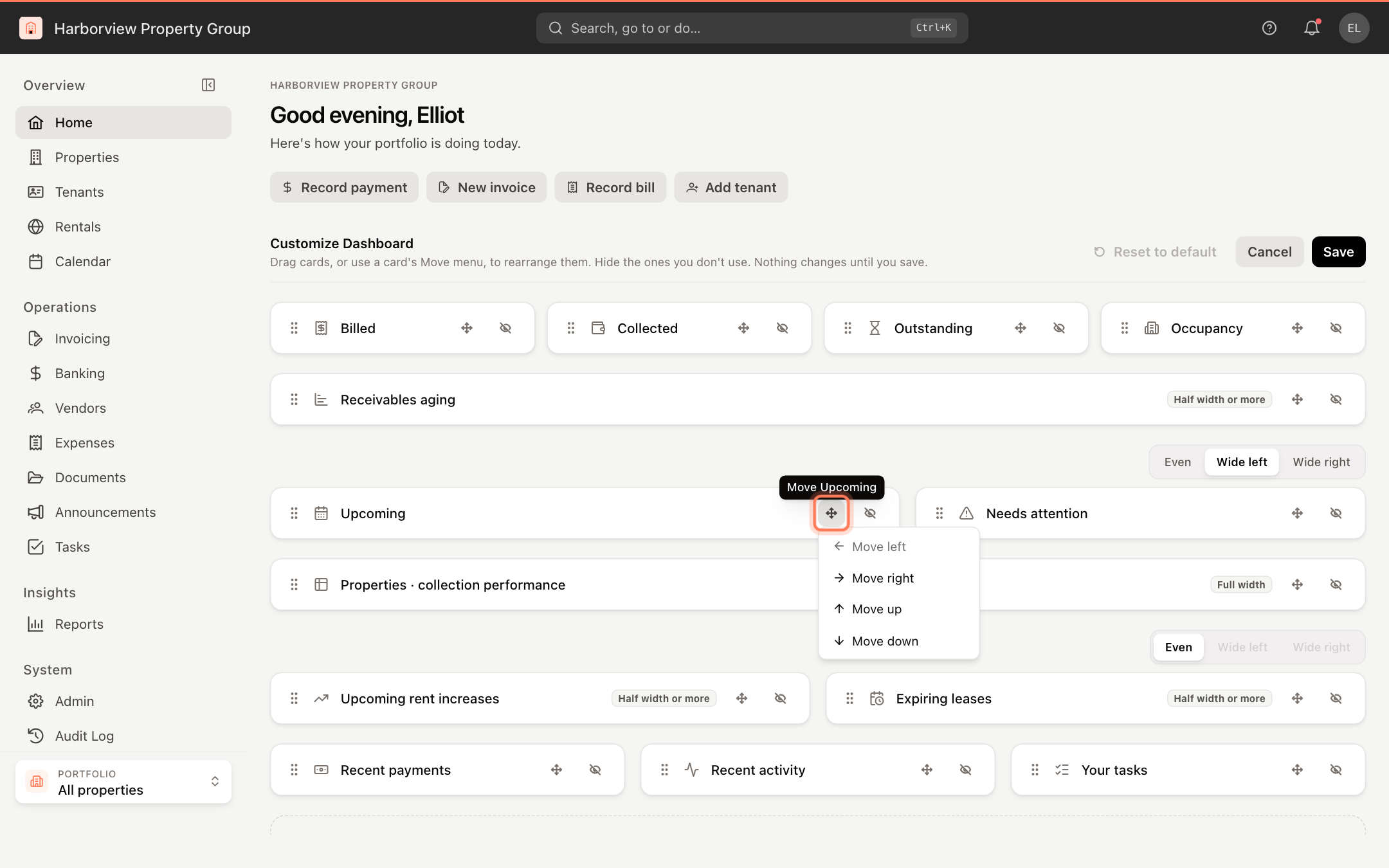
- Move left and Move right change the card's place in its row.
- Move up and Move down move the card one row at a time. A card that shares its row first gets a row of its own; a card that's on its own joins the next row if it fits there, and otherwise moves past it.
A direction that has nowhere to go is greyed out.
Set the widths of two cards side by side
A row with two cards has a width control above it:
| Option | Result |
|---|---|
| Even | Both cards are the same width. |
| Wide left | The left card is wider. |
| Wide right | The right card is wider. |
When a row changes to one or three cards, its cards go back to equal widths.
What fits in a row
- A row holds up to three cards, or up to four of the figure tiles (Billed, Collected, Outstanding, Occupancy).
- The figure tiles share rows only with each other.
- Properties · collection performance always takes a full row.
- Receivables aging, Upcoming rent increases and Expiring leases need at least half of their row, so each shares a row with at most one other card and is never the narrow one of a pair.
In Customize, these cards carry a label so you know before you move them: Full width or Half width or more. Point at the label for the rule.
On a phone or a narrow window, every row stacks into a single column in the same order.
Save, cancel or reset
- Save keeps your arrangement and closes Customize.
- Cancel discards your changes.
- Reset to default replaces your arrangement with the default layout, with every card shown. It asks you to confirm first, and is available once you have saved an arrangement.
If you leave Home with unsaved changes, UnitConnect asks whether to discard them. Click Keep editing to go back to Customize.
New cards added to UnitConnect appear at the bottom of your dashboard, so you see them even after you've customized. Cards you hid stay hidden.